01The product
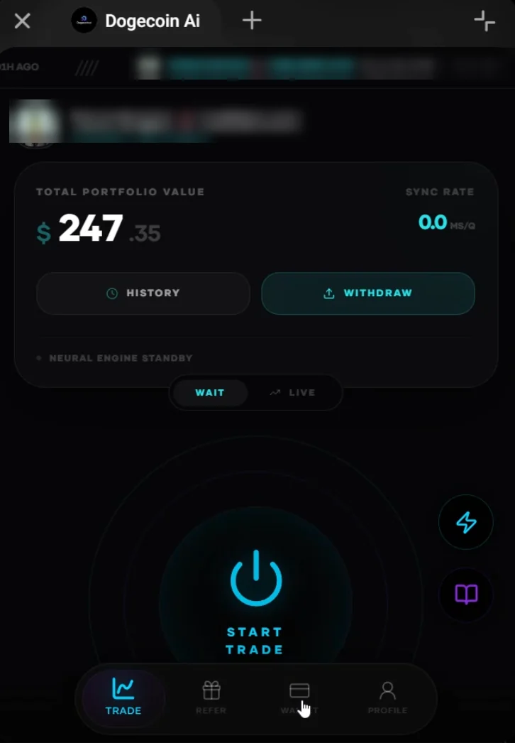
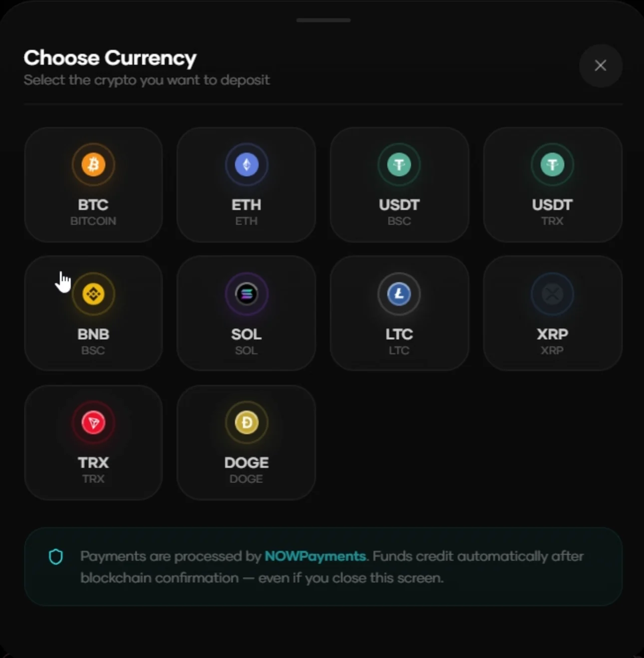
DogecoinAI is a Telegram Mini App. Users deposit funds, run automated trading sessions, move up through five account tiers and invite friends for referral rewards. Everything happens inside Telegram, so there's no app store download and no separate account to create.
I lead its design and engineering: the interface, the back end, payments, the bot and the landing page. More than 12,400 people have used it since launch, it has handled over $250K in trading volume, and it now processes 500+ trades every day.
Living inside Telegram shapes every decision. The screen is a phone held upright, the user has just tapped in from a chat, and they expect the app to feel as simple as the chat they came from.
02Older users were getting stuck
Soon after launch, the client's admin started passing on the same kind of message: people couldn't get through sign up. Looking at who was writing in, a pattern stood out. Many of them were older users, often new to crypto and not confident with apps.
The first version of onboarding had been designed the way I'd design for myself. It was compact, with small type, several fields on a screen and error messages written for someone who already knew what had gone wrong. For an experienced user it was quick. For someone unsure of every tap, each screen raised a question, and each question became a message to the admin.
The cost was bigger than lost sign ups. Every stuck user became support work for a small team, and people who struggle to get started are slow to trust an app with their money.
03What I changed
I rebuilt the flow around one rule: every screen answers one question and asks for one thing.
- Bolder, larger text. Instructions became readable at a glance, without squinting or zooming.
- One clear call to action per screen. Each step has a single main button that says exactly what it does.
- Fewer fields. I removed every field we didn't need to get someone started.
- Short errors that guide the next step. Instead of a vague "invalid input", each message says what went wrong and how to fix it.
The trade-off was length. Simpler steps meant more screens, and more screens can feel slower to someone who already knows what they're doing. I accepted that. The people dropping out needed clarity more than speed, and a confident user still gets through a simple screen in a second.
Every screen answers one question and asks for one thing.
04The result
After the new onboarding shipped, about 20% more users completed sign up, and help requests to the admin dropped sharply. The same principles now carry through the rest of the app, including a clearer withdrawal screen and the five-tier account system, which I shipped to live users without taking the app offline.
The product has kept growing on that foundation: 12,400+ users since launch, over $250K in trading volume, and 500+ trades a day.
05When a mistake stopped withdrawals
Not every problem lived in the interface. One day withdrawals stopped working. The cause wasn't a bug in the app but a mistake made in the admin panel.
I got withdrawals working again, but undoing the mistake only fixed that day. The real problem was that one wrong step in the admin panel could break the feature users care about most. So I added safeguards in the code that stop the same mistake from breaking withdrawals again.
That changed how I think about admin tools. They're part of the product too, and they need the same protection against mistakes as anything a user touches.
06What I'd do differently
Measure from day one. The 20% lift and the drop in help requests come from the client's own figures, not from tracking I set up. Next time I'd record where people stop during onboarding and count support requests before and after each change, so the result is a number rather than an impression.
Test with older users before launch. The problems they ran into were predictable. A few short sessions with people like them would have caught most of it before anyone got stuck.
 Enoch Daodu